It's been so long (2+ years) since I updated this site that I literally forgot everything. I had to reinstall Python3 and recreate my Nikola virtual environment.
In other news, I have a new art site that may or may not get updated more frequently than this site. That's right. I'm an artist now! No more coding! 🙅🏻♀️👩🏻💻 → 👩🏻🎨🎨 (jk, I totally still write something resembling JavaScript every day)
In June, I gave a talk at WomenTech Global 2020, a virtual conference hosted by CEO Anna Radulovski and her team. Anna reached out to me on LinkedIn a couple of weeks before the conference, asking whether I'd be interested in speaking. I love opportunities that drag me outside of my comfort zone, so of course I said yes!
And then I panicked. What was I even qualified to talk about?
Giving a conference talk is challenging for a number of reasons (unless you are blessed by the public speaking gods), but the most difficult part is selecting a topic. It's totally intimidating, like facing a blank page.
I scrambled for the next few days, shuffling through various topics related to frontend engineering, doubting whether I'd really learned anything of use in the 7+ years I've been working as a professional developer.
Optimistic Me: Data visualization?
Realistic Me: Oh, please. You used D3, what, five years ago, and you think you're an expert now?
OM: I could learn.
RM: You're gonna learn this whole field in two weeks?
OM: Okay, okay, maybe not. I guess I could talk about JavaScript, right? I know JavaScript pretty well.
RM: 45 minutes on closures, callbacks, arrow functions, async/await, and five ways to instantiate classes? Geez, sign me up.
OM: Are you saying that wouldn't be interesting???
RM: I'm saying, if people wanted to learn that stuff, they could just read JavaScript: The Good Parts. Or MDN. Don't be a textbook.
OM: Well...maybe I could talk about React?
RM: There are already two other talks on React.
OM: I could talk about React Hooks--
RM: No.
OM: But...what else is there?
RM: Hmm. Let's think. Is there, possibly, a technology that you absolutely love, with all your heart, that you've known for ages, that is incredibly cool, but it flies under the radar, so most people don't know it's incredibly cool?
OM: OhhhhhhHHHHhhhHHH you mean CSS
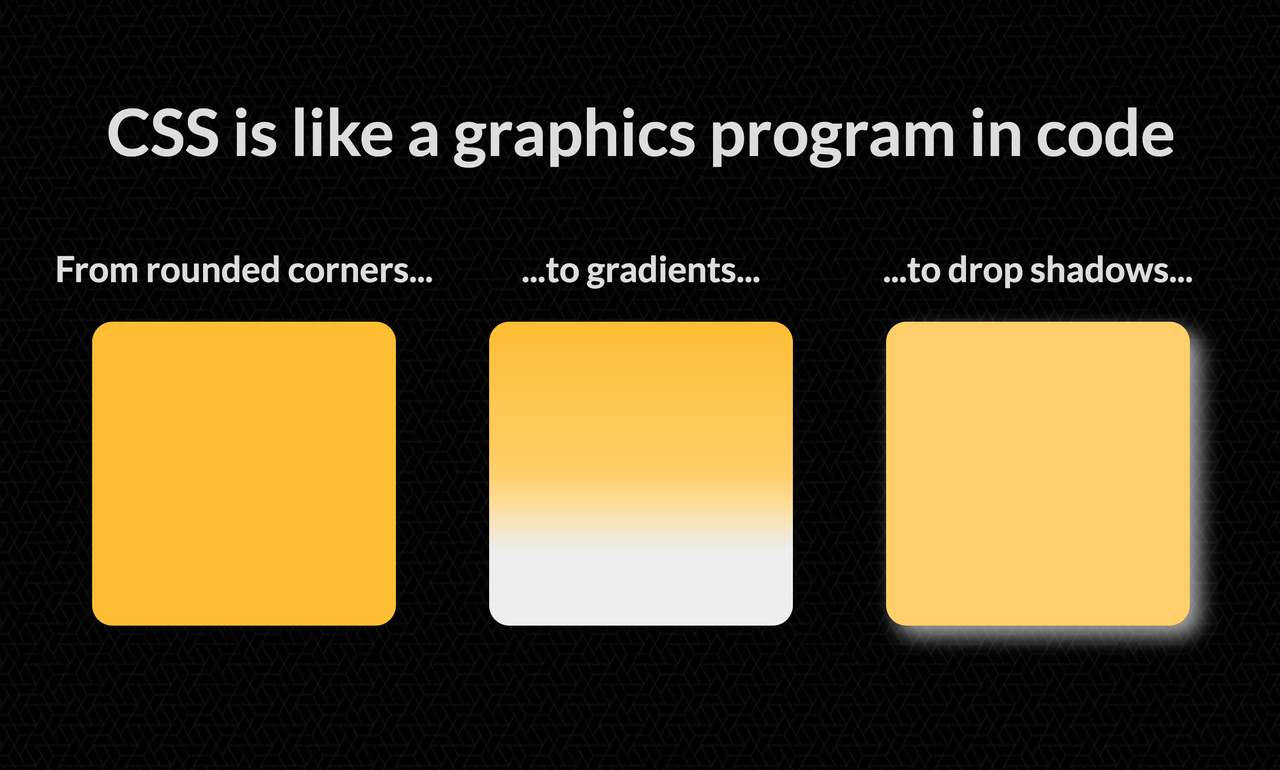
Cascading Style Sheets, my dear old friend
Just a taste of what CSS can do.
I like CSS way more than JavaScript. I like it more than English, too.
I learned CSS when I was a wee gal, during the glorious days of Web 1.0, when you could craft a second home on the internet without social media panopticons breathing over your shoulder.
Sure, there were some drawbacks during those days. You had to use HTML tables to create columns of text. You had to use Photoshop or PaintShopPro 7 to make gradients and rounded corners. Marquees and flashing text were all the rage. But that was the internet when it was beautiful.
CSS reminds me of that internet, and because of that, it fills me with joy.
My first website was an MSN Communities page. I quickly tired of it because I couldn't edit the look and feel of the site, so I went to Geocities, which at the time was the best way to create a free website. (I believe that Yahoo's downfall started the day they ended Geocities; no one can convince me otherwise.) Geocities had a “PageBuilder” feature that allowed users to move and style HTML elements within a drag-and-drop editor, which led to some pretty funky-looking sites, mine included. No matter how hard I tried, I couldn't get the elements to align properly.
I knew there had to be a better tool out there.
It sounds dramatic to say that CSS changed my life, but it kinda did. If it weren't for CSS, I would have given up on websites a long time ago. I wouldn't have started making websites again right after college, as an unemployed architecture grad, and then dreamed that hey, maybe someday I could even get paid to build a website. Imagine that!
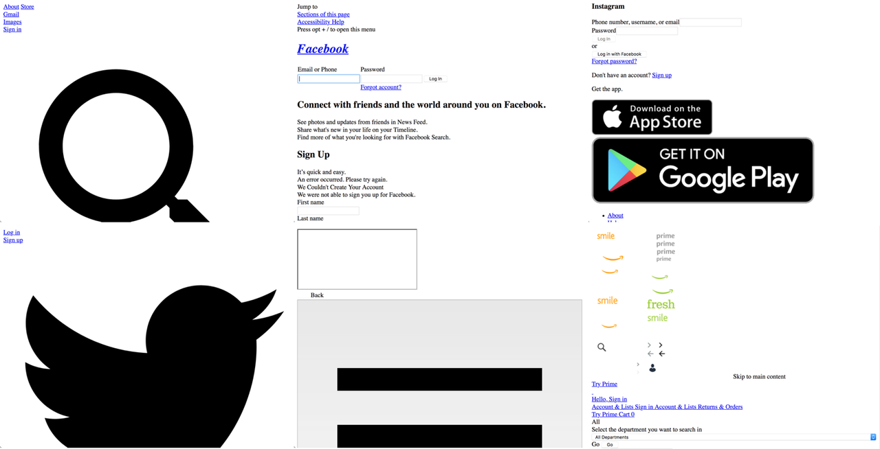
Honestly, I probably wouldn't use the internet without CSS, because it would look like this:
Six of the world's most popular websites, all sad and broken without CSS.
Over the years, CSS has become even more amazing. Yet I can't tell you how many times I've heard people -- mostly backend engineers, but some frontend engineers too -- dismiss this wonderful language as an afterthought, as a nice-to-have rather than a must-have.
Even at Hack Reactor, whose business was predicated on churning out new frontend engineers, we had a grand total of one lecture on CSS. Most of the content was outdated. Some of it was flat-out wrong. The focus was always JavaScript, JavaScript, JavaScript. Sure, JavaScript is great. It's important. It's the golden child. Meanwhile, CSS remains forever in the background, the overlooked, misunderstood, unsung hero of the web.
With this in mind, I had fuel for my conference talk. My goal wasn't to give an introduction to CSS (there are far too many tutorials for that), but to share my passion, and to demonstrate how fun CSS can be.
Creating my conference talk
Last year, I gave a talk at Women of Silicon Valley about my path from architecture ➡️ biz dev ➡️ software. While I at first had lofty goals for that presentation involving custom graphics, I eventually settled on a basic Keynote template. So, out of habit, I started creating this presentation in Keynote as well.
After about five slides, I started feeling like something was wrong.
Honest Me: What are you doing?
Defensive Me: What does it look like I'm doing? I'm making my CSS presentation.
HM: Uhh...nah, that's just a Keynote template.
DM: HEY! I spent hours working on these slides!
HM: I'm just saying. You can do better. Like, wayyyy better.
DM: No I can't.
HM: I'll tell you what you can't do. You can't just tell people that CSS is important and expect them to believe you. You need to prove it! With solid, incontrovertible evidence!
DM: O...kay.
HM: Imagine this. You're giving the talk. You're showing an example of a cool CSS thingamajig you built. But instead of switching back and forth between this Keynote template and the webpage with your example, you're just showing one seamless presentation. The example is part of the presentation. Wouldn't that be awesome?
DM: But I can't embed CSS examples into Keynote.
HM: Nope. Hahaha.
And that's why I scrapped my Keynote presentation and rebuilt it as a webpage.
You can find the presentation here. Check out the GitHub repo for navigation instructions and direct links to some of the most interesting slides (imo, I'm biased of course).
I practiced my talk with my family and one of my best friends, who's also a frontend engineer. They gave excellent feedback, which helped me to create a more cohesive and relatable presentation.
Connecting with a virtual audience
As I mentioned earlier, I spoke at Women of Silicon Valley in 2019. I was fully prepared, but when I walked to the front of that room that had seemed so small from the back (there were ~100 people), I felt sheer terror.
I've read that the fear of public speaking traces back to our instinctual fear of predators. Humans, like all predators, have their eyes in the front of their heads, so when speak publicly, we're standing before a crowd of predators. (Can't find a source for this exact idea, though. I may just be misinterpreting this Psychology Today article, which says that the ostracism we feel while speaking publicly makes us fear for our own survival.)
My biggest issue is that the adrenaline runs into my hands, no matter how much I prepare. Even if my voice sounds confident, my hands shake, and I end up doing silly things, like typing “boo.com” instead of “box.com” (this may or may not have happened while I was giving a live demo in front of my entire company).
At Women of Silicon Valley, I held a clicker in one hand and a microphone in the other. Both hands were shaking. I struggled with clicking the right arrow button to navigate to the next slide. My voice was a little too quiet, even with the microphone. The audience was supportive, and I didn't make any significant errors, but I left feeling like I could have expressed myself better.
WomenTech Global was a very different experience. The conference was completely virtual, hosted on Hopin.to. I commuted from my office into my dining nook, which has consistent lighting and a plain background, opened my presentation in a browser, and waited for my slot to begin.
I was nervous, of course, but significantly less nervous than I'd been at WoSV, even though my presentation consisted of multiple interactive slides.
Nervous Me: This is scary! I wanna go home.
Relaxed Me: You are home.
NM: Oh yeah.
RM: No one's going to attend anyway.
NM: But...THEY MIGHT! Some people found out about it on LinkedIn!
RM: So? It's the internet. People like posts without thinking twice. They've already liked a million other things by now.
NM: But...I'm on the agenda!
RM: You and a hundred other talks. Everyone's going to go to the talks about ML/data science/Python/React/social justice. CSS is just not flashy. Recruiters never reach out looking for CSS developers. They're always looking for React developers, aren't they?
NM: But...!
RM: Look. If anyone does show up, that means they're interested in what you have to say. They're not going to hurl tomatoes at you through the screen for being a less than perfect speaker. Besides, you know this presentation inside and out.
I took a deep breath, turned on my mic, and started speaking. Contrary to my expectations, about 30-40 people attended. When I reached the slide where I had to edit a CSS rule, I resorted to hunt-and-peck typing (which, thanks to the virtual format, no one could see).
Ultimately, the talk went really well -- better my practice sessions. I finished at the half hour mark, but the audience was lovely and filled the remaining 15 minutes with questions. Some of them even reached out to me afterward with more questions! I feel honored to have had this opportunity, and such a wonderful audience to boot 🙂
Other thoughts on public speaking
Would I speak at another conference, virtual or otherwise? Yes to both!
I'm a shy person. Not as shy as I was as a kid, or even a few years ago, but yeah, I'm shy. I don't like being in the spotlight. When I speak off the cuff, without sorting out my thoughts first, I space out and get tongue-tied.
It's precisely because of all these weaknesses that I try to do as much public speaking as I can. Public speaking has the potential to be deeply humiliating, but it can also be the exact opposite: exhilarating. There's nothing else quite like it.
Now, all I need to do is figure out my next conference topic.
Optimistic Me: 📊📈✨DATA VISUALIZATION ✨📈📊
Realistic Me: Why don't you try making some data visualizations first?
Blog notes: I haven't updated this blog since 2016. I would like to update more often than once every four years (ha), but I can't promise anything. I'm a very slow writer and my posts always end up being super long. This one is almost 2000 words!
This post is twofold. First up will be my long overdue review of Hack Reactor, and after that I'll share a few of the many lessons I learned while hunting for a job in Silicon Valley.
Was Hack Reactor worth it?
Short answer: Yes.
Long answer: For me, yes, it turned out to be worth it. What Hack Reactor promises, it delivers. When I speak of promises, I'm referring to the fine print of the student agreement, in which you pay $17,780 in exchange for a crash course in JavaScript plus job search training.
On both points, Hack Reactor absolutely excels. The software development curriculum is top-notch. I learned so much and so quickly that it felt like I was downloading information into my brain, which was pretty awesome.
How does Hack Reactor help people to learn so quickly? Different people will give different answers to this question. Some might say the lectures. Others might say the projects. For me, the crucial part of the learning experience was, unquestionably, the opportunity to interact with my remarkable classmates. My cohort was full of kind, brilliant people who encouraged and inspired me to be a better programmer. I learned a ton from working through problems with them, both in my pair programming assignments and in my group projects.
Because of my classmates, the 700-plus hours I spent in that concrete tower with the broken elevators at the southeast corner of the Tenderloin were not just tolerable. They were fun.
People often question the hiring statistics on the Hack Reactor website. I don't blame them; it seems ludicrous to suggest that fledgling programmers with no CS background or prior work experience could land six-figure salaries after three months at a for-profit bootcamp.
Now that I'm on the other side, it all makes sense. Most Hack Reactor grads end up in the Bay Area, which is flush with tech jobs and where the average going rate for software engineers is on the lower end of six figures. Hack Reactor also expends great effort on crafting and culling their student body. The program selects for students who have already demonstrated a certain level of proficiency in coding and trains those students in strictly practical matters: full-stack JavaScript, MVC frameworks, databases, version control, and those pesky algorithms questions that come up in technical interviews. We did toy problems, whiteboarding sessions, and mock interviews, all of which proved useful during my job search.
Hack Reactor also trained us to treat job searching as a job in itself, and to take it seriously, but not personally. We were encouraged to apply to five jobs every day and keep up with our toy problems.
I confess I did neither of those. But I did apply to 50+ companies total, and there was a memorable two-week period during which I had onsite interviews nearly every day. After a while, I finally understood what people mean when they say job searching is a numbers game.
Thoughts on the job search
It was more difficult than Hack Reactor.
Then again, I have a terrible aversion to unemployment. I also have bad memories of my previous job search, back in 2010, when I graduated into the recession with a useless degree and no marketable skills. At that time, I did a total of one phone screen and three onsite interviews, all spaced at least a week apart, and immediately took the one and only offer I received.
This job search was much, much better. In summary: looking for a job as a front-end engineer in the Bay Area in 2015 was a lot easier than looking for a job as an entry-level sales/marketing/administrative assistant in Los Angeles in 2010, but it was still very difficult. Some of the things I learned:
You're interviewing the company as much as the company is interviewing you
Both you and the company are evaluating each other to see whether there's a good fit. I was looking for companies that showed interest in me beyond my ability to code.
Because of that, I could always tell within the first five minutes how the interview would turn out. Some interviewers started by asking about my background, which made me more interested in those companies. Others started by asking me programming questions, which indicated to me that they didn't really care who I was as long as I could code, and those interviews quickly went south. There were no surprises.
Soft skills are just as important as technical skills
The technical interview process is more than just Cracking the Coding Interview. Being able to build rapport with an interviewer is critical. Interviewers want to see that you're someone they can get along with and would want to work with. And some companies, particularly startups, place an even higher premium on soft skills than on technical skills.
Caveat: possible confirmation bias. Maybe I just happened to fail all the interviews that were 100% technical. I also only applied for front-end positions, which generally have an easier (for me) interview process.
Narratives matter
I spent a long time crafting my narrative. Four and a half years to be exact. Remember that one offer I received in 2010? It was for a business development internship paying fifty cents above minimum wage.
Nowadays when I tell people that, they reel in shock. Minimum wage! Well, sure, why not? I wasn't entitled to anything. Back then, my narrative was weak. Practically nonexistent. I was a fresh college graduate with no real work experience, who had decided, in a mystifying twist, not to pursue a career in the field she'd spent four years studying.
I knew I just needed to start working as soon as possible. So I took the offer, and it turned out to be one of the best decisions I've ever made. That company gave me so many opportunities to be so many different people: a salesperson, an administrative assistant, a receptionist, a marketer, a customer service representative, an account manager, an internship program coordinator, a copywriter, a designer, and finally, a front-end developer.
Everyone has a strong narrative inside of them; it's just a matter of storytelling. Frame your background in a way that helps employers to see that the next logical step in your narrative would be working for them.
Job search support is essential
Looking for a job is a degrading and stressful experience. Mine would have been much worse if it weren't for the support of my friends at Hack Reactor. During the first couple of weeks of my search, I complained to a friend that while I'd had a bunch of phone screens and remote technical interviews, I hadn't yet had any onsites. He told me to stop whining and start actively applying for jobs on AngelList. It was the best advice I received during the process. Following that advice led to a flurry of onsites, which in turn yielded good results.
AngelList is awesome
AngelList introduced me to a ton of interesting startups. If you're on the hunt for a software job, make sure you've created a candidate profile and set it to actively looking!
Failing an interview is not the end of the world
The interviews I failed prepared me for the interviews I didn't fail. After a while, I became quite comfortable with rejection. In fact, one day I reached out to so many companies on AngelList that I ended up getting rejection letters from companies I didn't even remember applying to. Some of those companies are still sending me rejection letters!
Rejection can be personal, but it's best not to take it personally. As I mentioned above, interviewing is a mutual process. Companies reject candidates for all sorts of reasons.
The stereotypical -- and some might say "ideal" -- software engineer is male and holds a degree in computer science from a top engineering school. I'm a woman who didn't learn to code until long after college, and I was fully prepared to be discriminated against during the job search for these reasons. But I was pleasantly surprised.
For years, I've lamented what I studied in college (architecture), which continually tops lists of majors with the highest unemployment rate. In 2010, it was difficult to prove in interviews that I could work hard and excel at jobs that had nothing to do with my major.
Architecture came up much less frequently during my last job search. Most Hack Reactor grads have an unusual trajectory, so no one expected me to have a CS degree. I'm also five years out of college, so my work experience has finally trumped where I went to school and what I studied. During my interviews, an interesting pattern emerged: not only did employers not mind my lack of a CS degree; some of them liked the fact that I'd studied architecture and even reached out to me because of it.
Again, possible caveat: front-end engineers are often expected to have design skills, or at least an appreciation for design. I assume employers would prefer to hire CS majors for backend positions if possible.
One of my former housemates asked me if I felt employers discriminated me in the job search because I'm a woman. I'm happy to say that the answer is, on the whole, no. If anything, I suspect the scales were tipped slightly in my favor because of my gender. Female software engineers are still unfortunately rare, so I imagine it was easier for employers to remember me. (I'll refrain from further speculation, as it would feed into my impostor syndrome to believe that employers deliberately recruited me to fill diversity quotas, or that they held me to a lower technical standard than they did for male candidates.)
But wait, there's more!
I wrote the bulk of this post in June 2015, right after I started my new job. I still stand by everything I wrote above, but with one clarification. I realize I may have given the impression that being a smooth talker and keeping a blog will make up for a lack of technical ability, which is absolutely not true.
During the past few months, I've switched over to the other side of the technical interview process. While evaluating 20+ candidates for front-end positions at my company, I've found that the most successful candidates possess strong technical skills as well as strong soft skills. (Big surprise there!)
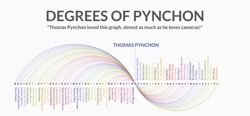
We spent two days last week working on solo projects at Hack Reactor. I built a visualization of literary influences, beginning with Thomas Pynchon -- who, aside from being totally amazing, a genius, and one of my personal role models, also has a lengthy section on Wikipedia full of writers who influenced him and writers he's influenced.
Thomas Pynchon's circle of influence
To visualize the relationships between Pynchon and the writers connected to him, I created an arc diagram in D3. Initially, I planned on using D3's built-in chord layout generator, but I fell in love with arc diagrams after seeing so many beautiful examples online (e.g., Bible Cross-References, Command Usage Arc Diagrams, The Shape of Song, among others).
I went down a few rabbit holes, including creating a matrix dataset similar to those required by the chord layout and plotting the writers as nodes on a scale. Thankfully, there's this wonderful Les Misérables character co-ocurrences arc diagram, also in D3, which set me on the right track.
I formatted the influence data into an object with two arrays, nodes and links. Each node contains the name of a writer and a number indicating the writer's category (influencer or influencee), and each link contains a connection between Thomas Pynchon and another writer.
Click for the interactive version. I stole the quote from the Simpsons episode in which Thomas Pynchon reviews Marge's book. For anyone unfamiliar with Pynchon: he does not love cameras.
All the influencers appear to the left of Pynchon, with an arc above the horizontal; all the influencees appear to the right, with an arc below the horizontal. The colors were generated by D3's category20b scale.
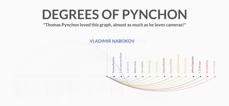
Other circles of influence
I also wanted to visualize the influences of the other writers. Initially, I added all their connections to Pynchon's graph. This worked for Vladimir Nabokov but failed for Emily Dickinson, who was influenced by a writer who appeared to the right of her (Ralph Waldo Emerson) -- resulting in a backwards connection.
The solution was to create new graphs and layer them on top of Pynchon's. So, clicking on Nabokov's name (for instance) will fade out Pynchon's graph, increase the size of Nabokov's name, move his name and dot to the center of the page, draw a line from his name to the center dot, and display his influence graph around that new center. Mousing away from Nabokov's graph will delete his graph and bring back Pynchon's.
Vladimir Nabokov's literary influences
Figuring out how to rearrange the new graph around the new center dot was probably the most difficult part of the entire project. I passed the center position to the new graph and gave the influencer dots a negative x-axis position so that they appeared to the left of the center dot.
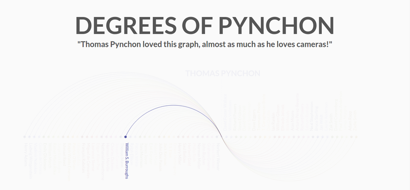
Hover selections
The last feature I added was a hover selection event. Mousing over a writer's name will fade out the entire diagram except for the name, dot, and arc belonging to that writer.
Hovering over William S. Burroughs
This was the second most difficult part of the project, because of the preexisting fade effects associated with the click event. The entire graph fades out upon clicking a name, and the entire graph fades back in when the mouse leaves the new graph.
I ended up initializing a boolean to keep everything in check: multipleGraphsOnPage starts off as false, becomes true when a new graph is created, and reverts to false when the new graph is deleted. The hover selection event is enabled only when multipleGraphsOnPage is false.
My project completion strategy
The purpose of the solo project was not to build a perfect product, but a minimum viable product. Hack Reactor instructed us to reduce the size of our scope in half, twice -- which I didn't even need to do, since I'd deliberately chosen a very small scope to begin with. The extra time afforded me the chance to polish the look and feel of my project, including the animations, and dive deeper into D3.
This project was really fun. D3 is by far my favorite JavaScript library ever, and I can't wait to make more visualizations with it.
At the risk of losing all my design cred, I'll admit I put practically no effort or even thought into the way my blog looked until about a week ago. To put that into perspective: I wrote my first post here in May 2013. For most of the time since that point, it's been some variation of this default Bootstrap theme provided by Nikola, the static site generator I use:
Nikola, while excellent, has slim pickings for themes, and none of them are quite what I want my blog to look like. So when it came time for the big overhaul, I started (almost) from scratch with a new theme.
The process
Nikola themes live within the appropriately named themes directory. My files are structured as follows:
Defines pages that contain multiple posts (the "index" pages)
post.tmpl
Defines an individual post
engine
Text file containing the name of the templating engine your theme uses. The two options are mako and jinja.
parent
Text file containing the name of the theme from which your theme inherits. Mine inherits from base.
That's it! I used the similarly bare monospace theme as a guide. You can spruce up your theme with additional templates (see the zen theme for an example), but I decided to keep mine simple.
Now for the fun stuff!
There's another reason why the default theme didn't work that well for my blog: I'm wordy as hell. I don't write posts; I write essays. So, rather than change my style of blogging, I thought I'd pull off an illusion. My main objective in redesigning this blog was to make it resemble a series of digestible sentences, as opposed to the giant wall of text that it actually is.
For inspiration, I looked at Medium, Longreads, Nautilus, Aeon, and all the other beautiful text-heavy sites that have cropped up in recent years.
Fonts
Typefaces can make or break a design. For the headers, I picked Lato, my favorite web font of all time; for regular text, Lora, my other favorite web font of all time. Both are available on Google Fonts. To improve readability, I increased the size of the text and the space between each line.
Colors
The link styles (salmon color + hover transitions) are from an old WordPress theme I created back in 2012, before I became a front-end developer. My CSS may have improved since then, but my visual tastes haven't changed much.
My first pass at the new theme had an entirely white background, which tested poorly. "It's really white," commented one of my Hack Reactor classmates, as he shielded his eyes from the glare.* I subsequently reduced the white space and added a background from Subtle Patterns. I picked a food icon pattern because, well, I love food.
Other changes
I removed the Share button that used to sit in the bottom right corner. It took me forever to figure out how to do this, but all I had to do was uncomment the SOCIAL_BUTTONS_CODE = "" line in conf.py.
Final thoughts
Designs are never finished, but I'm happy with how my blog looks right now. I plan to implement a hamburger menu for smaller screens within the upcoming weeks. If you have any suggestions, or find your viewing experience to be less than optimal, please let me know.
* With much gratitude to my Hack Reactor classmates for giving me the necessary push to redesign my blog.